5 Common Real Estate Photography Mistakes
and How To Fix Them…
- Blowing Out The Sky
Over exposing the sky so that it is white or an unappealing gray like the one above, is known as ‘blowing out the sky’. It results from exposing for the house instead of the sky, making the sky so bright that there is no detail or color. This typically happens when using auto mode and the camera makes a bad ‘decision’ for the exposure setting or when the photographer uses too slow of a shutter speed when facing the sun.
A similar condition can occur when the sky is extremely overcast.
Move the slide bar to reveal the difference
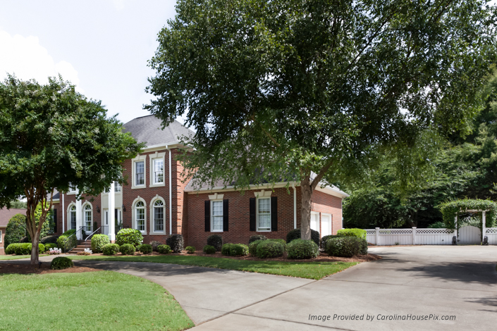
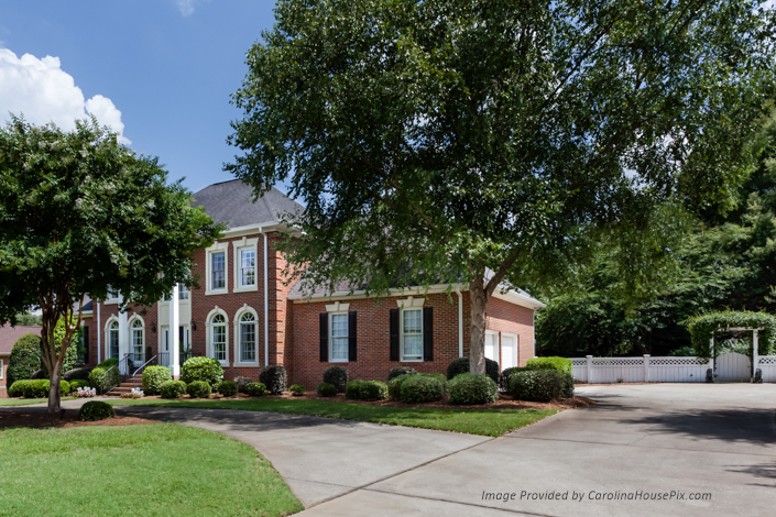
By using manual mode you can expose for the brightness of the sky and clear up the resulting darker house in Lightroom or Photoshop. You could also use a tripod and take two exposures, one for the sky and one for the house and then hand blend the two in photoshop. If you absolutely have to take that all important exterior photo facing into the sun or on a cloudy day, invest some time in learning how to replace that ugly sky with a nice natural looking blue one. Just be careful to match the brightness of the replacement sky to the landscape – especially when the sky being replaced was a cloudy overcast sky.
- Not Staging For Photography
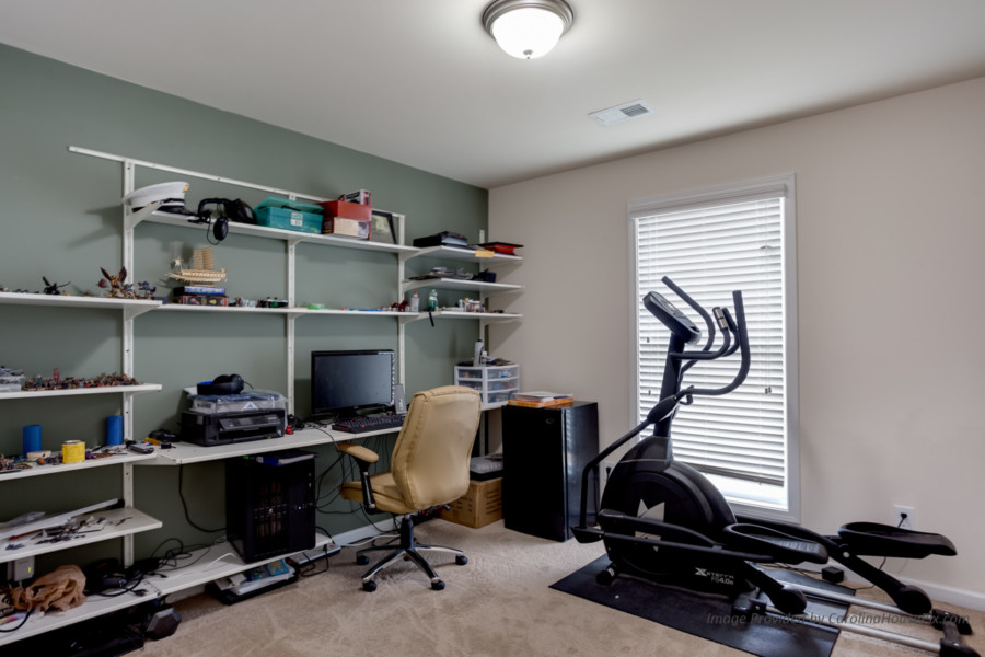
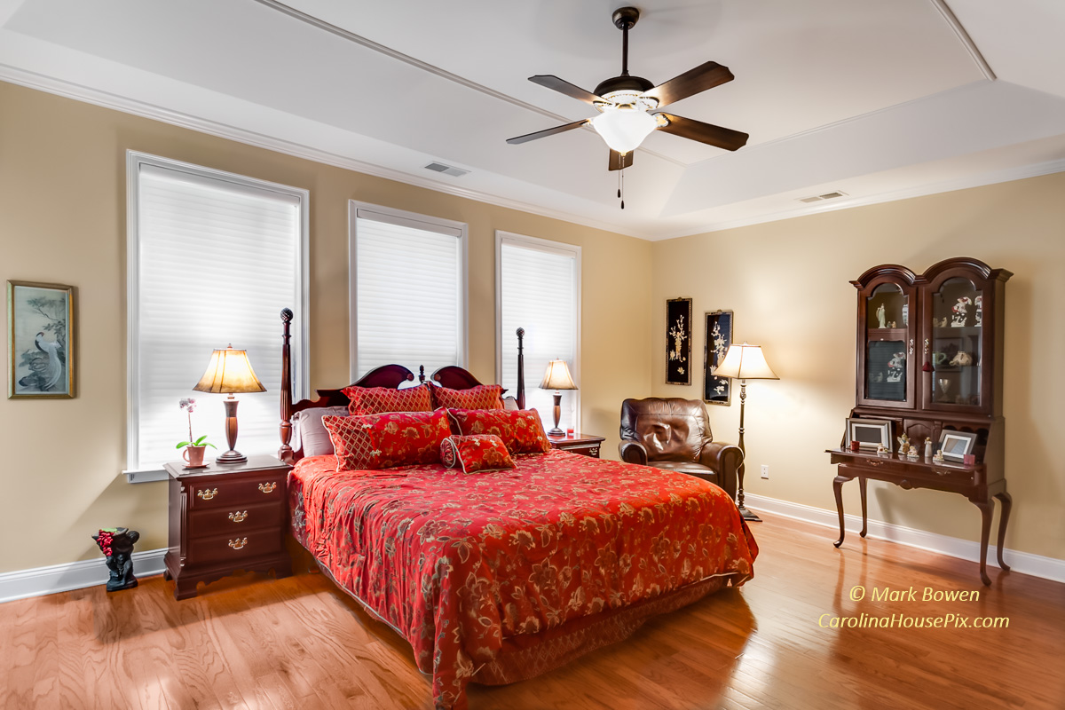
We provide an extensive checklist to guide home sellers on how to stage for photography. Not just Inside… outside is just as important because its what gets them in there to look. Things like cars in the driveway, unmanicured lawn and shrubs, cluttered yard, cluttered porches or patios, covered or dirty swimming pool, etc. Inside, some of the most common staging mistakes are things like refrigerator magnets, cluttered kitchen and bathroom counters, personal items left out, garbage cans left out, wrinkled linens and furniture coverings, ceiling fans left running, burned out light bulbs, and the list goes on.
- Posting Too Many Photos
Just because MLS gives you room for 36 photos doesn’t mean you need to show 36 photos. In fact, research by Point2.com shows that the optimal number of photos is between 15 and 20, with 15 being ideal.
The takeaway here is that using a few high quality professionally composed and edited photos will get and keep a viewer’s attention far longer and will generate far more leads than a gazillion mediocre quality photos can.
- Taking Photos Of Furniture Instead Of The Living Space
If you are taking photos for an interior designer or a furniture company or if you are documenting items for insurance purposes, pictures of the furniture are wonderful. People who are shopping for homes want to see the space and the flow of the home, so be careful not to focus on furnishings.
- Using A Cell Phone Or Tablet To Take Photos
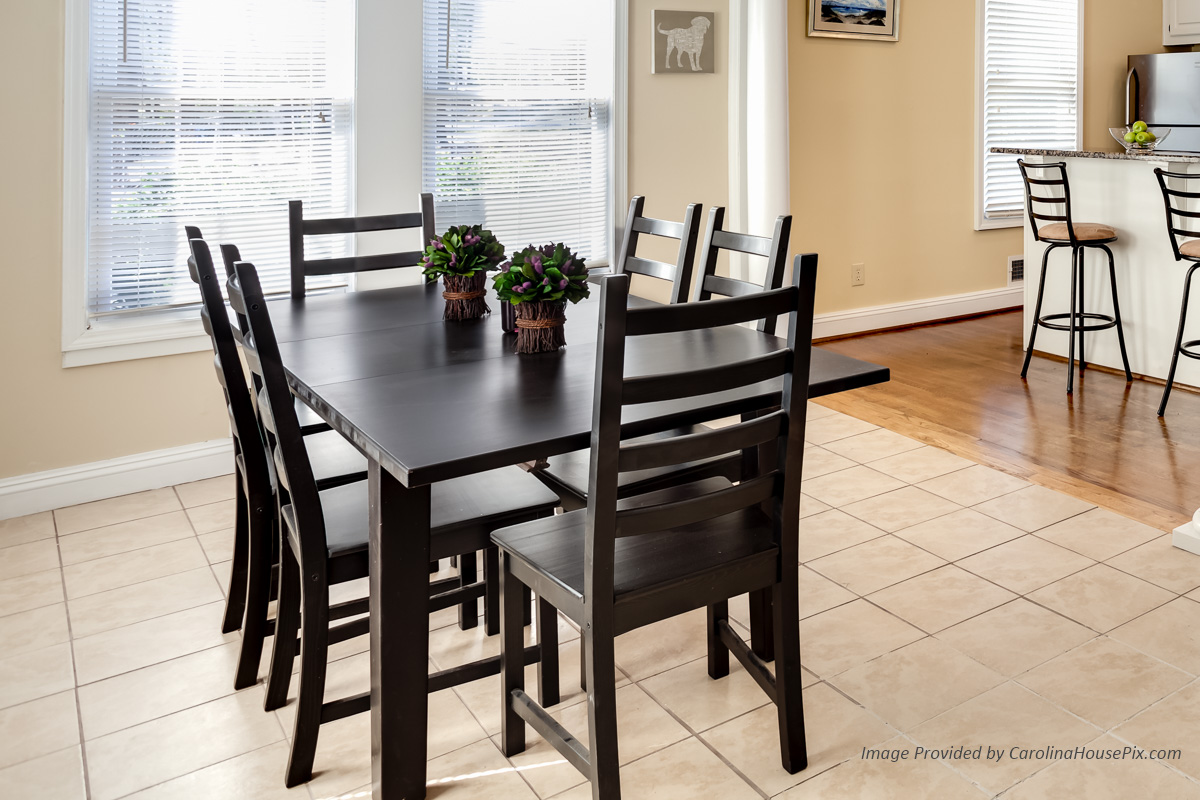
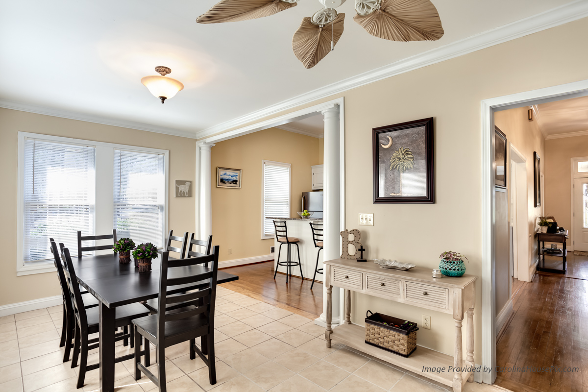
While very convenient, the cameras in cell phones and tablets are designed mainly to take snapshots of people, but not large architectural and interior spaces. Even though some cell phones are capable of fairly high resolutions, these devices have small sensors, fixed lenses with a narrow field of view, inadequate on-board flash, and have aspect ratios that are not usually very compatible with MLS. The result is a low quality photo that translates to something that looks mediocre at best.
The fix is simple – just don’t use them. Instead, invest in a DSLR and a wide angle lens… even a very high end point & shoot camera would be a far cry better than a cell phone or tablet.
Shot With Full Frame DSLR + Wide Angle Lens
Many of these mistakes can be avoided by simply slowing down and caring about the results. If you don’t have time to learn how to compose good photos using the right equipment, or if you just don’t have time to take photos – hire a professional who has trained in real estate photography and understands the nuances and technical aspects of photographing architecture.
Even when hiring a “pro”, caution should be taken… just because they have a DSLR and charge money doesn’t mean they know how to professionally craft a real estate photo.
For quality professionally crafted real estate photography Contact Us Here


